Print + Publications
Project Shortcuts:
Solvang Walking Map
Solvang Chamber of Commerce Walking Map | 2018


The Solvang Chamber of Commerce Walking Map was a labor of love from start to finish, though never truly finished, as this was definitely considered a "living document" as I worked with the client over the years to tackle the challenge of the ever-changing landscape of the beloved tourist trap. Businesses came and went faster than anyone could ever predict, leading to a digital version being produced (and updated more frequently) in addition to the printed hard-copy maps which measure 24" x 18" and fold down into a convenient traditional brochure size.
Flat Files


Allan Hancock College: Community Education Spectrum
Print Publication | Summer 2022

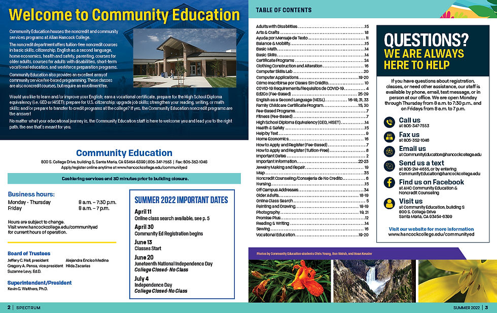
The Allan Hancock College Community Education Spectrum is a tri-annual bulk mail publication created to advertise class listings for the college's noncredit course offerings including fee based and tuition free classes. The publication is aimed a wide target audience ranging from elementary aged children, young adults, ESL students, elderly folks, and everyone in-between. This of course provides quite a challenge since the design needs to be eye-catching enough to entice young learners but still user friendly enough for the vision impaired and grey haired. Each publication is also designated a season relevant theme and color scheme, the selected sample highlights a summer iteration. This document was my sole responsibility as a designer from cover to cover, and went through a number of format, size, and layout changes over the five years it was in my care.

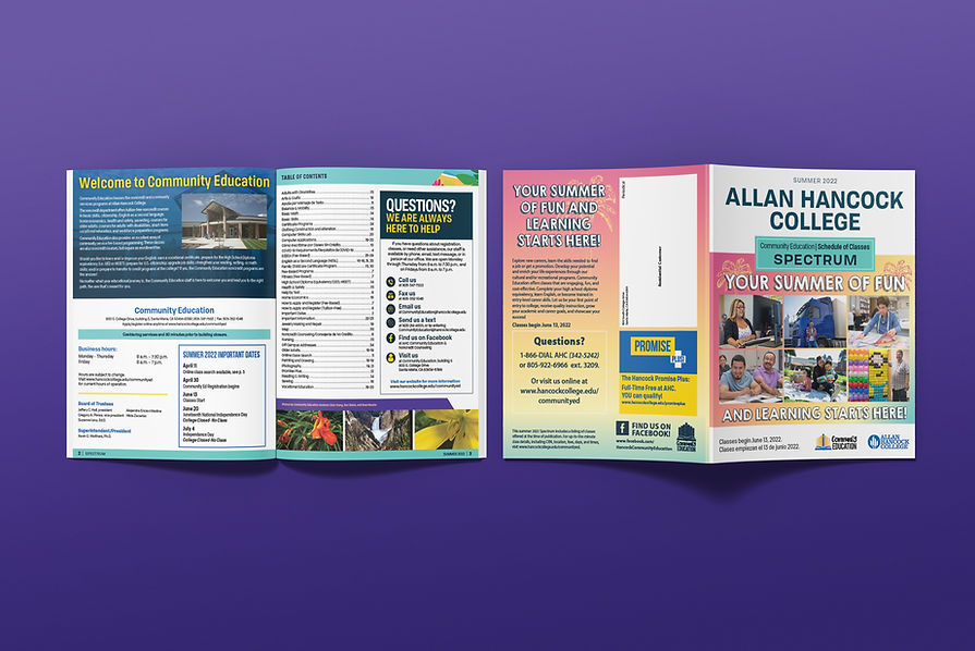

Cover Art


Internal Pages (as Spreads)


Poster Designs
An Ongoing Series


Printed Ephemera | Spring 2023
Power HER Promise Roundup Campaign

The Power HER Promise Roundup campaign was created to generate additional donation-based income for the Girl Scouts of California's Central Coast. The premise is fairly common among other retail businesses both nonprofit and for-profit, whenever a customer makes a purchase at one of the GSCCC retail and program centers they are prompted with an option to round up their total to the nearest dollar, with the knowledge that the additional difference will go towards the funding of programs and events. The collateral generated for this campaign was entirely print-based, consisting of double-sided 22" x 28" standing signs, 8.5" x 11" flyers (also used in acrylic frames on countertops for additional signage), lockbox tip jars with a 14" x 5" insert, and 3" buttons worn by staff to promote the campaign. Everything created for this campaign adhered strictly to the Girl Scouts Brand Standards and Guidelines, including the use of brand-specific fonts, colors, shapes, and applicable use of the council's Service Mark. Photos selected for this campaign are of local Girl Scouts displaying the hand gesture used when reciting the Girl Scout Promise, as a tie-in to the name of the campaign. The photos chosen were also selected with a focus on diversity and with the goal of featuring girls that were local to the council being represented.

Tip Jar Inserts

22" x 28" Poster for Standing Displays

3" Buttons
3" Buttons
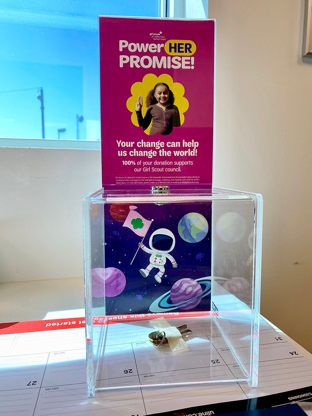
Lockbox Tip Jar with Graphic Insert
