Branding
Project Shortcuts:
Dreamers Vegan Takeout
Locally Owned Mexican Vegan Pop-Up Restaurant | 2021

A fusion of many things, this branding was designed to encompass all aspects of the clients' business. The name itself inspired by the non-residential status of the owner, a DACA (Dream Act) recipient. This plant-based pop-up served everything from diner classics, greasy deep-fried fair faire, traditional Mexican cuisine and so much more, with a mission of spreading love, compassion, and good eats. The seven stars are representative of each member of the clients close family that had supported them through difficult times. The lunar imagery a reminder of the famous quote "Shoot for the moon, for even if you miss, you will land among the stars." The enclosing shape resembles a dinner plate and the lettering was selected to evoke a vintage diner feel, and borrows very subtly from the visual cues of the famous athletic wordmarks as a nod to the clients' love of sports and healthy activities. The brand was extended to a number of uses, including but not limited to signage, merchandise, web graphics, custom .GIFs, and packaging materials.
Logo Variations

1:1 Graphics


16:9 Graphics



Animated GIFs
Custom Mascot


Ephemera & Merchandise


Signage


The Hancock Promise
Allan Hancock College Promise Initiative | 2017

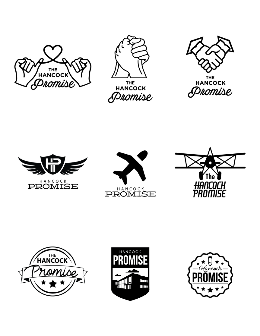
The Hancock Promise logo was designed to provide an identity for Allan Hancock College’s Promise program that provides high schools graduates within the district with their first year tuition-free. This logo and brand identity was a collaborative effort that I had the pleasure of directing and materializing. For the word mark of this logo, we referenced archived signatures from the founder of the college, Mr. G. Allan Hancock. We then digitized the signature and placed it next to the sans serif font, Bebas Neue, for contrast. The hills of the logo mark are representative of the metaphorical mountains our prospective students have had to climb to reach this new chapter in their lives, they are also illustrative on a more literal level of the local hills and agricultural community that is very prominent in the college's location, Santa Maria, CA. In its early days, Hancock college began as an aeronautic school, the bi-plane shown is reminiscent of that era. Furthermore, the plane, as well as the clouds, also convey the way our Promise lifts our students up to new heights and brings them out of the storm and into a brighter, clearer future.
Mockup Mood Board

Initial Logo Comps
Refined Logo Comps
Refined Logo Comps

Final Logo

Logo Variations

In addition to the main Promise logo, there are three supplemental logos in the Promise family. The Path to the Promise logo, which depicts an airport runway symbolizing the students preparing to take flight with the Promise. The logo that follows the flagship Promise logo is the Extended Promise which consists of a mortarboard soaring through the air, which is symbolic of the services provided to students to help them achieve their academic goals. An additional logo was also designed for the funding and patron-ship of the Promise, Partner with the Promise, shows a set of hands clasped in a handshake also in the shape of the heart, is representative of the partnerships the college is nurturing with businesses with an interest in empowering the community. Each component of the Promise brand is connected and complementary to one another, comprising a family of culture conscious sub-identities designed to encourage a college-going culture.
Ephemera & Merchandise


Signage

Campus Graphics
Allan Hancock College In-Plant Print Shop Identity | 2019

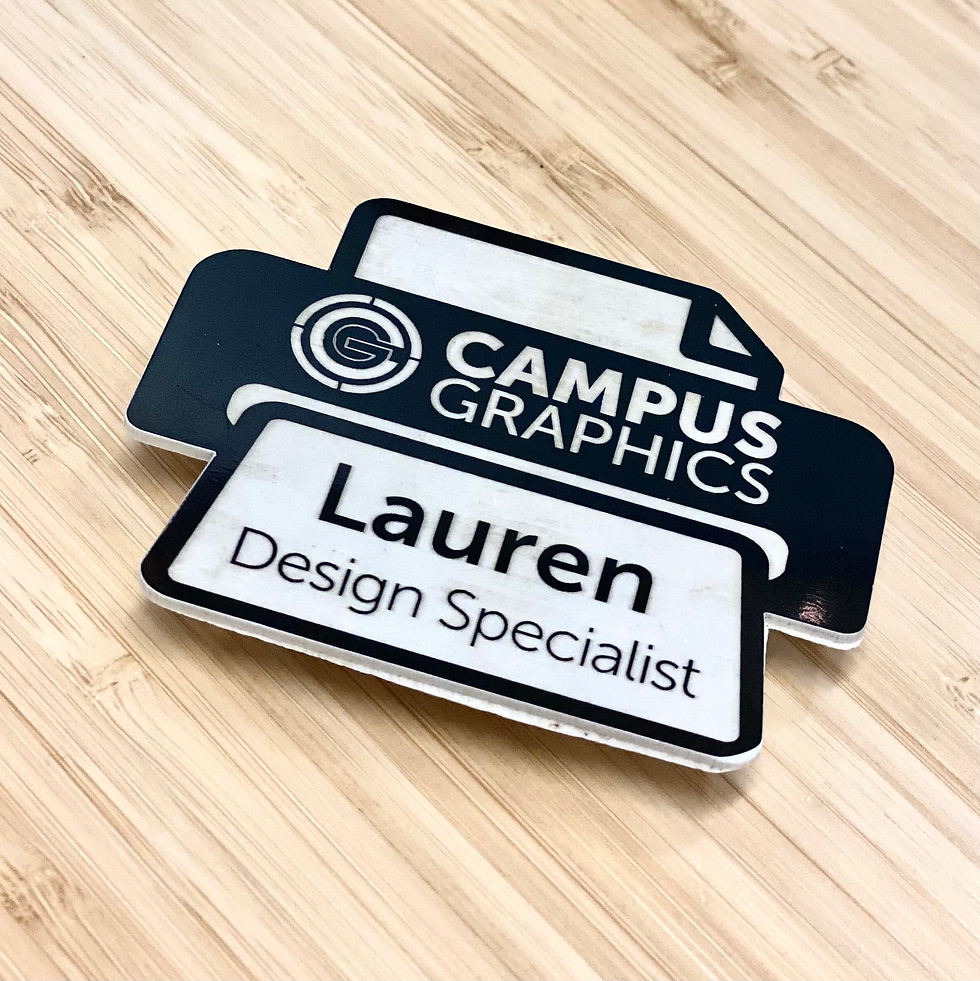
The Campus Graphics identity began as a proactive effort to brand Allan Hancock College's in-plant print shop to market it to non-profit and education institutions outside of the college. The logo mark itself is designed to evoke the feel of registration marks often seen in offset printing, generally the more aligned the marks are the better and higher quality the print production is, and Campus Graphics always aims to produce the highest quality work possible. The interlocked monogram is representative of how the college (shown as the letter "C") encompasses and houses the print shop (indicated by the letter "G"), and how the two have a very intertwined yet symbiotic relationship. The colors chosen are those most commonly used in four color print processes: Cyan, Magenta, Yellow, and Key Black. Furthermore, the overall shape of the logo resembling a target is symbolic of how the shop always aims to be on target whether it's with production timelines, industry trends, or the customers' wants and needs, Campus Graphics delivers right on target.
Logo Variations


Ephemera & Merchandise


Girl Scouts Early Bird Registration
Girl Scouts of California's Central Coast | 2024

2024
Each year, beginning around April, Girl Scouts of California's Central Coast (GSCCC) opens their Early Bird Registration for membership to join or renew for the upcoming Girl Scout year. To encourage and entice new and current members to submit for their membership early, GSCCC creates themed promotional incentives unique to the council that may include items like shirts, water bottles, stickers, and more that incorporate fun and inspirational designs and messaging to reinforce the organizations mission to build girls of courage, confidence, and character, who make the world a better place.
2023
2023

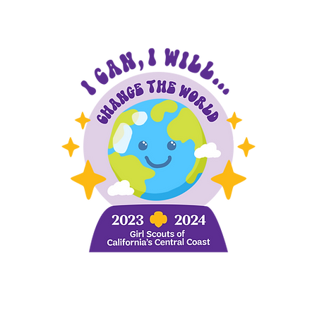
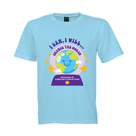
For the 2023-2024 Membership Year, the theme was "I Can, I Will... Change the World" and focused on the benefits of practicing positive affirmations to improve a girl's self confidence, resilience, outlook on life, and overall mental wellbeing. Incentives for this initiative included a branded shirt, a girl-designed patch, a council-designed patch, a set of Tech Tattoo stickers, a worksheet with positive affirmations, program credits, and a set of daily affirmation cards.


Patch Design
Shirt Design


Physical Patch

Email Signature Graphics

Web + Email Graphics

Affirmation Flyer
2024

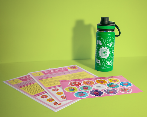
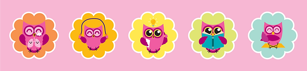
For the 2024-2025 Membership Year, the theme was "Be a Better Who? Be a Better YOU!" and focused on the benefits of utilizing a toolkit of coping skills ranging from breathing exercises to problem solving and asking for help, these skills were specifically selected and designed to help girls face a world that has become increasingly difficult to navigate in terms of mental wellbeing. Incentives for this initiative included a uniquely-designed water bottle and sticker system that rewards girls with a special sticker to place on the metal reusable water bottle once a new coping skill has been learned, as well as a girl-designed patch, a council-designed patch, a worksheet with the coping skills to learn to earn a sticker, program credits, and a weekend of camping.


Patch Design
Physical Patch

Promotional Social Graphic

Water Bottle Flat Art

Sticker Sheet Flat Art


Coping Skills Worksheet

Email Signature Graphics

Website Header

Website Image
Website Banner

Website Banner